drupal

LN Webworks: Drupal Staffing and How Can You Benefit from It?

Image removed.

Drupal staffing is an incredible way of accessing the services of top-notch Drupal developers without hiring them in-house. This saves you money and helps you provide your Drupal development team with the assistance of Drupal experts as and when required. Today, a majority of companies consider availing of Drupal staff augmentation services a necessity as there is a shortage of Drupal talent worldwide. This is particularly because as a cutting-edge and rapidly evolving content management system (CMS) Drupal has a steep learning curve involved. Another major reason why organizations seek Drupal staff augmentation is that it also acts as a gateway for them to accomplish technological evolution and improve operational efficiency at a low cost. 

Now let’s delve into the lucrative benefits of staff augmentation to give you a detailed idea of why more and more businesses are inclining toward it. 

The Higglers Company: DrupalCon Portland 2024 Call for Papers Now Open.

Attention all Drupal enthusiasts! The call for papers for DrupalCon Portland 2024 is now open for a month. Don't miss your chance to share your expertise and insights with the Drupal community. Whether you're a seasoned Drupal pro or just getting started, we want to hear from you. Submit your paper today and join us in Portland for this exciting event. Contact us to learn more about DrupalCon Portland 2024 and the call for papers.

Electric Citizen: See you at HighEdWeb 2023

Image removed.

At Electric Citizen, we have long partnered with clients in higher education – from large universities to community colleges. 

Image removed.

That's why we're excited to be sponsoring this year's HighEdWeb conference, dedicated to the intersection of web professionals and higher ed. From Oct 8th to 11th, 2023, we'll be at booth #300 in the exhibit hall.  

This will be our first in-person visit to Buffalo, NY, and we can't wait. Stop by our booth to chat about what our team can do your organization, from strategy and design to web development and ongoing support. We're a team of Drupal experts and open-source enthusiasts, with over 11 years experience in partnering in the education space. Plus we have some fun swag to give away.

For those who can make it, I hope to see you there!

Consensus Enterprises: Aegir5 Roadmap Update: Planning & Estimation

The Road(map) so far Back in June, we submitted a Pitch-burgh pitch to seek funding to finally get Aegir 5 fully off the ground. Prior to that, we had been working to build a roadmap to push our prototype implementation up to feature parity and an initial release for broader community participation. In parallel to that, we’d been publishing this series of posts with the goal of culminating in a roadmap and action plan.

Specbee: The Basics and Beyond of CSS Units

In the world of web design, there was a need for a common language that could help designers and developers speak the same styling dialect. This is where CSS units, came into play. CSS units are like the measuring tape when you’re building a house, ingredients in a recipe for web design. CSS units are crucial for specifying the size of elements on a web page. Whether you want to set the width of a div, the height of an image, or the font size of text, CSS units allow you to express these dimensions precisely. In this article, we'll go over some of the most commonly used CSS units, typography, and some new CSS viewport units. Decoding CSS Units We use PX, PT, EM, REM, %, VW, VH, VMIN, and VMAX as CSS units. CSS units can be classified into two categories: Absolute and Relative units. Each of them serves different purposes and use cases. Absolute Units Pixels (px),  points (pt), and picas (pc) fall under absolute units and can be considered as fixed units, such as px. They do not change based on the context or the size of the parent element. For example, 10px always represents the same physical size, regardless of screen resolution or the surrounding elements. They are often used when precise control over element sizes is required, such as setting the dimensions of images or specific layout elements. Relative Units The %, em, rem, vh, and vw are relative units. Relative values are not fixed. They are dynamic and depend on something else, like the root element's font size or the browser’s default font size. They’re suitable for creating responsive designs that adjust to different screen sizes and user preferences. Relative units are commonly used for font sizing, margins, padding, and responsive layouts. PX ‘px’ is the easiest measurement to use. But there is a drawback. For example, when we use pixels throughout our site we implement media queries too. In this case, what happens when a user changes the default font size of his browser? Font sizes implemented with PX units will remain the same. As a result, the user’s font preferences won’t take place. Which is not a good user experience. So, using pixels for spacing and layout is fine but is not a good use for font size. ems and rems come to the rescue. EM 'em' values are dependent on the font size of its parent element. We may experience problems when working with em units due to the effect on the inheritance of em values. As all elements inherit the font sizes of their parent, em values compound linearly as the level of nesting increases. Example: Suppose you have a paragraph inside a element, and the font size of the is set to 16px, and the paragraph has a font size of 1.5em. In this case, the paragraph's font size would be 1.5 times the font size of its parent , resulting in 24px (1.5 * 16px). REM 'rem' values are dependent on the font size of the root element, Or the default font size of browsers. And if the font size of the root element isn't set, its value depends on the browser's default font size. Example: If you set an element's font size to 2rem, it will be twice the size of the root element's font size. So, if the root element's font size is 16px, the element with 2rem font size will be 32px (2 * 16px). Typography: Using px, rem, and em Typography in web design involves using various CSS units like "px" (pixels), "rem" (root em), and "em" (em) to size and style text elements for optimal readability and design consistency. Each unit has its own characteristics and advantages, and understanding when to use them is essential for effective typography. 'rem' values are relative to the root font size, This means that when the root font size is 16px, a value of 1rem would be 16px. This way we can have a different root font size for a different @media query. Making it scalable for each @media query. Since 'em' is dependent on the font size of the nearest parent, with em, we can control how the webpage scales on the modular level. New CSS Viewport Units Viewport units offer a straightforward way to size and position elements based on the dimensions of the viewport, providing a better user experience across a wide range of devices and screen sizes. A few new viewport units were introduced in March 2022, like svh, lvh, dvh, svw, lvw, and dvw . 'Svh' is used for the smallest viewport height that is visible to users. The smallest possible viewport height excludes the address bar which by default is included in the VH unit. 'Lvh' is used for the largest viewport height visible to the users. It includes the address bar and other interfaces provided by the user agent. 'Dvh' reflects the current viewport height. This unit excludes the user agent's interfaces. It reflects how much vertical viewport height the user agent's interface currently covers up. For example, it will change as the user scrolls down a page on small screens because the address bar moves out of your screen. Same as the Vh unit, We can add modifiers in VW turning them into more precise viewport units like svw, lvw, and dvw. Final Thoughts CSS units are the building blocks of web design, allowing designers and developers to control the size, spacing, and layout of elements on a web page. The choice of units depends on the design goals and responsiveness requirements of the project. When web designing, it's essential to strike a balance between fixed and relative units, using them strategically to achieve the desired visual aesthetics and responsiveness. If you’re looking for expert UI/UX design services, send us an email and we’ll get back to you soon! 

Talking Drupal: Talking Drupal #418 - Inclusive Hiring Practices

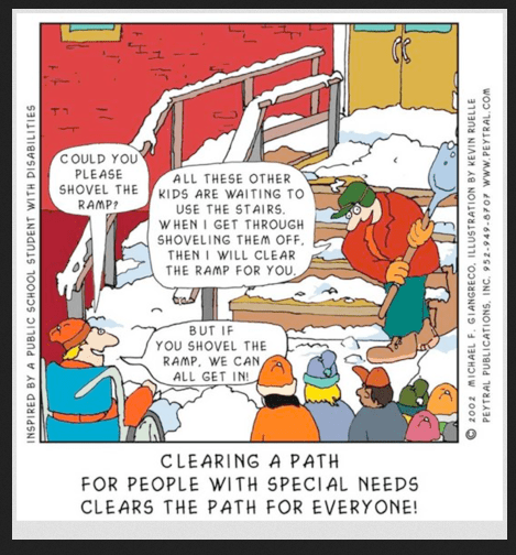
Today we are talking about Inclusive Hiring Practices, Disability Employment Awareness Month, and tips to improve your hiring practices with our guest Donna Bungard. We’ll also cover Organigrams as our module of the week.

For show notes visit: www.talkingDrupal.com/418

Topics
  • When is National Disability Awareness Month
  • What is the definition of Inclusive in this context
  • Why are inclusive hiring practices important
  • Have organizations been doing well with this
  • What is disclosure and how can it impact people
  • What can organizations do to be more inclusive
  • What tools can be used to improve hiring practices
  • Whose responsibility is it to address issues
  • Any closing thoughts
Resources

National Disability Employment Awareness Month Snow shovel cartoon Curb-cut effect

Race after technology Center for accessible technology Apple assistive tech

Guests

Donna Bungard - @dbungard

Hosts

Nic Laflin - nLighteneddevelopment.com nicxvan John Picozzi - epam.com johnpicozzi Jen Lampton - jenlampton.com - jenlampton

MOTW Correspondent

Martin Anderson-Clutz - @mandclu Organigrams

  • Brief description:
    • Have you ever needed a way to define and display an org chart on your Drupal website? There’s a module for that.
  • Brief history
    • How old: created in Apr 2016 by PatrickScheffer
    • Versions available: 7.x-1.3, 8.x-1.3, and 8.x-2.3 versions, the last two of which can be used with Drupal 8, 9, and 10
  • Maintainership
    • Maintenance fixes only
  • Number of open issues:
    • 2 issues, neither are bugs
  • Usage stats:
    • 377 sites
  • Module features and usage
    • The module works by extending core’s taxonomy hierarchy management
    • You can organize who reports to who with a simple drag-and-drop, the same as any taxonomy hierarchy. For anyone who hasn’t used those, it would be basically the same as managing a menu structure
    • Once created, an organigram can be viewed as a dedicated page, a block, and a token
    • The 2.x branch uses Flexbox to achieve a CSS-only presentation that removes the need for any Javascript
    • Appears to have been built to serve the needs of the Dutch House of Representatives
    • I haven’t tested it, but I suspect that for a site with a very large organigram they need to build, tools like Client Side Hierarchical Select, built to make managing large taxonomies easier, are likely to work with Organigrams too